Less can be much more when it comes to designing a website, t-shirt, or business logo. This comes as good news to us who aren’t that artistically inclined to begin with. But even seasoned illustrators cannot ignore the power of negative space.
Negative space is simply leaving empty spaces in your design, intentionally. We tend to think of flashy and complex designs as being the most impressive and valuable for our business. But the world’s most popular and powerful design in the world owes its success not to a brilliantly busy design, but rather to negative space.
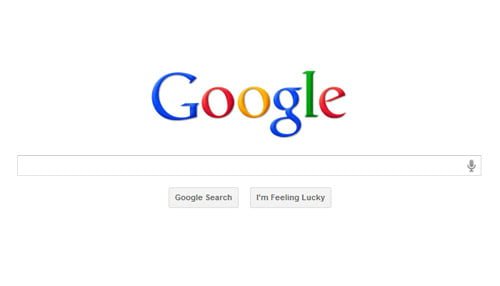
I’m talking about the Google website logo. In the early days of the internet, Google was in competition with Yahoo, AOL, and many other sites for popularity. These other sites were cluttered with information, logos, designs. and information. By stark contrast, Google’s logo leaves about 70% or more of the screen completely blank, with a simple design in the center.
Analysts agree that the clean, unassuming presentation is one factor that graviated people towards the internet giant. What does this mean for your website, business, or personal design?
It means that you can do just as much to attract your customers by leaving design elements out as you can by putting them in. Today, with people being overloaded with images and sounds from TVs, smartphones, billboards, and more, landing on a page with a well thought out and aesthetically pleasing amount of empty space actually has a calming and attention grabbing effect.
Negative space does not have to be totally blank. It can include a design pattern or texture. It also doesn’t have to be a large chunk of space. Negative space can refer to the space between design objects. In fact, one appealing guideline for design is to decrease the negative space between related objects, and increase it between unrelated ones.
Google remains a great example. You can imagine your design broken down into shapes. In Google’s homepage, they have their main logo in the center, right next to the search box. All the way up in the top left hand corner are menu items like maps, videos, etc. On the top right is your login info, on the bottom right Google’s company info and on the bottom right background image information. All of the relevant items are grouped together in their own area but separated by a good deal of white space.
The human eye is drawn to similarly grouped items, and we intuitively feel more relaxed and assured when there is space is a design versus clutter. By strategically planning out your design with negative space, you can actually do less work and leave a lasting impression on your customers.


