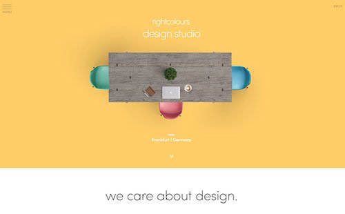
As a web designer, you’re paid to create a great looking website for your customers. Chances are, you have some fantastic tricks up your sleeve to create a beautiful site. But have you also been incorporating sales conversion aspects into your projects?
Therein lies the Web Designer’s Dilemma – do I focus on design or conversion?
Here are some tips to help you solve the Web Designer’s dilemma so you are confident that you are addressing all of your clients’ needs (design and sales).
Focus on your client and their needs

Image Credit: Nax84
Often, we get caught up in the design and how it reflects ourselves as a designer. However, we need to put our ego aside and focus on our clients and their needs. And their needs, more often than not, is a website that is going to convert visitors into playing customers.
But just because you are focusing on your client, doesn’t mean that you have to push the design aside. You just need to make sure the look matches the client’s brand and the customers they want to attract.
One way to help ensure the design matches the brand and leads to sales is to ask your client about their brand and clients. Take the time up-front to gather the essential information. This will cut down on editing time and will result in a happy client who is more than willing to refer new business your way.
Keep the focus on sales

Image Credit: Ninteen47
When you are designing a website, you will want to do it in a manner that will lead customers to the sale. Think about the information they will need to make their shopping decision. Then, put that information within their eye path so it is easy for them to find.
Extensive research has been conducted to show how consumers look at web pages and digest the information. Through eye tracking, researchers have found that web users typically digest information in an “F” shaped pattern.
First, they do a horizontal movement with their eyes across the upper portion of the page. Then, they skip down to the middle of the page and do another horizontal sweep. Lastly, they scan the left portion of the page in a vertical movement.
Keeping the “F” pattern in mind with designing the navigation will help ensure visitors to the site are able to quickly find the information they are seeking.
Don’t forget the secondary pages

Image Credit: Google Website Optimizer
When designing a website, it’s important to remember that users won’t always enter the site through the homepage. Search engines may bring up results for a secondary page that contains the content that the visitor is seeking. This makes it important for the site to have consistent design on each page.
It also makes it important to incorporate sales tools on each page. For example, if you are designing a website that will allow consumers to purchase merchandise, you will want a “shopping cart” link on each page so it is easy for users to see what is in their cart and check out.


