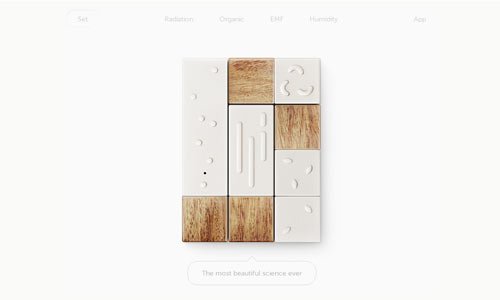
Blank or empty space between and around elements is called white space. This negative space is given to make design look clean and awesome. You can’t ignore the importance of white space in your designs. It can enhanace the performance and readability of a website, if used correctly.
Although many think it’s a waste of space, white space is an essential element in web design. It’s often as important the content itself. In this post we bring you 25 excellent examples of white space usage in web design. Hope the collection will inspire you.
If you like this article, you might be interested in other articles on Schools for Photography, Photographer Portfolio Websites and Coming Soon Pages.


